In the summer of 1854, two water companies ran their pipes down the same streets south of the Thames in London. Households drank from one or the other, and one company drew its water from the river downstream of the city’s sewage. The other had moved its intake upstream. The pipes ran side by side, and neighbors often could not say which company filled their taps. That summer, cholera came back.
A doctor named John Snow went house to house to find out which company served each house. Where people could not say, he carried a little of their water home in a small bottle. A drop of silver nitrate, a chemical that clouds in salty water, turned the downstream company’s water cloudy white and left the upstream supply nearly clear. Through that epidemic, the downstream company’s houses lost 315 people to cholera for every 10,000 houses. The upstream company’s lost 37. That is more than eight times the deaths, among people who shared streets, air and weather.
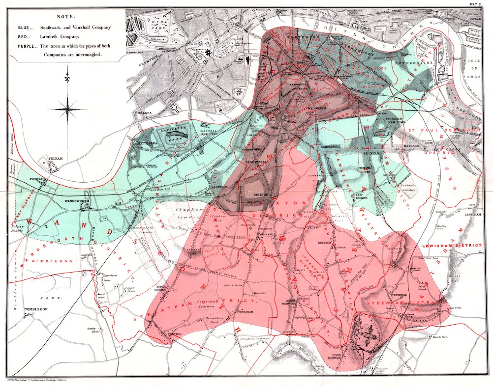
Figure 1. The water supply of the districts south of the Thames, from John Snow’s On the Mode of Communication of Cholera (second edition, 1855). Blue is the Southwark and Vauxhall company’s area, red the Lambeth company’s, and purple the streets where “the pipes of both Companies are intermingled.” The color is the data, so this map is not shown in grayscale. Public domain, via Project Gutenberg ebook 72894.
“What causes cholera?” was a debate. Most doctors held that disease rose from filth as a foul smell, a miasma. A government committee wrote of Snow’s idea, “we see no reason to adopt this belief.” The debate could not be settled as asked. A smaller question could. Do houses on the downstream company’s water die more than their neighbors on the upstream company’s? Nobody chose which houses got which pipe; a landlord had, years before, for reasons that had nothing to do with cholera. The world had sorted the groups, and counting answered the question directly.
The patient portal pings after a blood test, and this year’s blood sugar sits beside last year’s, a little higher, still marked in range. More than two in five American adults have prediabetes, blood sugar above normal but not yet diabetes. Eight in ten people with prediabetes do not know they have it. You read the number on a phone in the kitchen you grew up in, a parent with diabetes at the table. Do you act on a number still marked in range, or wait a year for the next test? The portal cannot say whether a number read now arrives in time to change anything.
The woman of the Chicago heat-wave piece, who wrote out her four-part question at forty-seven, is fifty-five now. One checkup adds a second name to her polycystic ovary syndrome (PCOS), a hormone disorder that often makes the body respond poorly to insulin. Her HbA1c reads 6.6 percent. HbA1c is a blood test that reads the average blood sugar over about three months, and at 6.5, a doctor calls it diabetes. Women with PCOS carry about three and a half times the risk of type 2 diabetes. A review of 23 studies found that excess only in women whose weight was also high. Hers has been high since the chart read a body mass index of 27 at twenty-five. Thirty years of metformin, a pill that helps the body use insulin, delayed the diagnosis and did not prevent it.
The same checkup reads her hip: a T-score of -1.8, a measure of how far bone density falls below a young adult’s average. That is low, but short of the -2.5 that defines osteoporosis. Two chronic conditions in one woman, PCOS and diabetes, make the multimorbidity the second part’s trial was built for. The checkup reads her blood and her bone, and nobody times her walk. She leaves with two leaflets and the same breakfast waiting at home.
Before any data, the second part said, each of my questions has to set its comparison, its measure, and its rule for whatever happens partway through. This part asks the next thing of the three questions on the body’s side: once the data exist, is there a method that answers each one directly? Snow’s count is the standard. The handle on the Broad Street pump, the better-known half of his story, came off after the dying had slowed. First, her training, which she has kept up since forty-seven: how much of it is enough?
How Much Is Enough
Two strength days and three walks a week, for eight years. Her question at fifty-five is whether that is the least that keeps her walking on her own at eighty, or more than she needs. The second part’s computer model of bone said a higher start buys more than a slower fall. Most of the bone a body will ever have is laid down by about thirty. The hip that reads -1.8 is still spending what she banked in her twenties. What is the smallest dose of strength and aerobic training in midlife that keeps the most function at eighty? That is my first question (Q111, Figure 2).
Part two
Answerable question
In exercise science, a minimal dose is the smallest amount of training, below the usual guideline, that still produces the benefit. Finding it starts with a curve. Hannah Arem and colleagues pooled six studies of about 661,000 adults and counted deaths at each level of weekly leisure exercise. The standard recipe is 150 minutes of moderate activity a week. Those who exercised but fell short of it had about a 20 percent lower risk of dying than those who did nothing. Meeting it brought the drop to 31 percent. Most of the drop came with the first steps up from doing nothing, and less with each step after. A curve that bends near zero means the first ten minutes buy more than the last ten.
A trial that sets the full recipe against nothing can say whether exercise helps. It cannot say where the bend sits, because it measures only two points on the curve. Finding the smallest dose that works takes several doses, and a model that lets the curve bend where the data bend.
“Dose-response models are regression models where the independent variable is usually referred to as the dose or concentration whilst the dependent variable is usually referred to as response or effect.”
The bend is drawn with restricted cubic splines: short curved pieces joined smoothly into one line. The line is held straight at the two ends, where the data thin out, so it can bend in the middle without flapping at the tails. Her dose, two strength days and three walks, is one point on that curve. What matters is whether the curve has flattened by the time it reaches her.
Then comes the heart attack at seventy that the second part wrote into her question as an event the study has to plan for. Her diabetes makes it likelier: people with diabetes die of any cause at about 1.8 times the rate of people without. Someone who dies at seventy never gets measured walking at eighty. Drop that person from the count, and the study assumes, without saying so, that she would have walked like the women who lived. The first part found that deaths make poor witnesses, since each is tallied under a single cause. Here death is not a cause to be sorted but an exit that rules out the outcome. My field calls such an exit a competing risk.
“A competing risk is an event whose occurrence precludes the occurrence of the primary event of interest.”
For the method to fit, the outcome has to be a time, not a snapshot. It is the age at which she can no longer walk on her own, with death before that as the competing event. Function measured once at eighty is a different problem, because the women who died first have no reading at all. Jason Fine and Robert Gray gave the time version its model in 1999. Their regression keeps the women who died in the denominator instead of treating them as if they had simply left the study. Fine-Gray regression, run on a curve of doses, gives the chance of losing independent walking by eighty at each dose, with death counted as its own answer. The training is chosen, not assigned, so the curve is an association; a causal “enough” needs a trial that assigns doses, which is another split.
Sunday’s plan for the week, written on the fridge, is one week of the dose. The guideline pairs the 150 minutes with strength work on two or more days, and the strength days are what to look for on the plan. Counting them takes a pen and a minute. The dose is one question. Which level of the body the answer lives at is another.
Same Number, Different Roads
Two people can leave the same clinic with the same 6.6 percent and different futures. In 2018, a Swedish team sorted about 9,000 adults newly diagnosed with diabetes. Six measurements split them into five groups. In one group, the cells that make insulin were failing. Another group made plenty of insulin that the body could not use, and that group had the highest risk of kidney disease. All of them came from one region of southern Sweden. One number on the lab sheet, and at least five roads behind it.
Which road a person is on depends on the level at which the disease is modeled. A body is built in levels, each made of the one below: molecules, cells, tissues, organs, organ systems, the whole organism. A disease can be modeled at a gene, at a pathway that many genes feed, at a network of pathways, or at the whole person. Which level is the right one, and can the data say? That is my second question (Q121, Figure 3).
Part two
Answerable questions
The gene level has its own design. A 2024 study pooled more than two and a half million people. It found 611 places in the genome linked to type 2 diabetes. The strongest, in a gene called TCF7L2, raises the risk by about 45 percent in people who carry one copy. Most of the rest raise it by a few percent each.
“Genome-wide association studies (GWAS) test hundreds of thousands of genetic variants across many genomes to find those statistically associated with a specific trait or disease.”
A genome has millions of places that could line up with diabetes by chance, and so does the layer of marks on top of it. So my field believes a single signal only when chance alone would give a result that strong less than about 5 times in 100 million. That line is called genome-wide significance. Then the study sorted its 611 signals into eight groups by what they seem to act on: the insulin-making cells, the way the body stores fat, the liver. Her own condition was searched the same way in 2018. A study of about 10,000 women with PCOS found 14 places in the genome past that line. Its genetic signal as a whole runs with obesity, fasting insulin and type 2 diabetes. At the gene level, her PCOS and her diabetes share ground. At the pathway level, that ground has a name, insulin resistance, and at the level of the whole person it is one woman at breakfast.
A GWAS answers only at the gene level. To choose between levels, the data have to be asked which one predicts best, and my field has a way to ask without fooling itself. Build a model at each level, gene, pathway, network, whole person, and test each one on people it never saw. The trap is that choosing a model’s settings on the same people it is then scored on makes every model look better than it is. Nested cross-validation closes the trap with two loops. An inner loop picks the settings on training data only, and an outer loop scores the chosen model on data held entirely apart. It is work I have done on genetic data, and it answers “which level predicts best” directly. It does not say which level causes the disease.
The family-history box on an intake form, ticked for a parent’s diabetes, is the same question in a kitchen. The thing to find out is the age the parent was diagnosed. The question to ask is whether the risk is shared through the genes or through the kitchen. A level that predicts is not yet a level that explains, and the third question asks what the body’s own clock has to say.
Older Than Its Owner
A model trained on thousands of brain scans learns what a healthy brain looks like from 40 to 70. Then it reads a new scan and returns a number: this brain looks 58, and its owner is 52. The number is a brain age, the age a model predicts from a scan, and the gap between it and the birthday is the thing to watch. A group of 669 Scottish adults, all born in 1936, had brain scans in their early seventies. Over the following years, those whose brains looked older than their age were more likely to die. In a 2013 study, older adults with type 2 diabetes had brains that looked about four and a half years older than their age. That study caught both at one moment, so it cannot say which came first.
Which exposures speed a body’s clock, and does the gap between a body’s age and its birthday predict the next disease? That is my third question (Q122). The first half is a question about cause, and cause is where Snow’s water companies come back.
“The common thread in most definitions is that exposure to the event or intervention of interest has not been manipulated by the researcher.”
Snow found two groups alike in almost everything but the water, so the water stood out, the way migration sorted two groups who share an ancestry. Nobody assigned the pipes at random, and Snow could only count. But a gap that large, between next-door neighbors, was hard to explain any other way.
Her weight raises the same kind of question. Did her weight bring on the PCOS, or did the PCOS bring the weight? No trial can assign weight at birth. Genes can. The variants that raise body weight are handed out at conception, by the shuffle of a parent’s genes into a child, and no researcher chose who got them. In 2003, George Davey Smith and Shah Ebrahim named the design.
“Mendelian randomization—the random assortment of genes from parents to offspring that occurs during gamete formation and conception—provides one method for assessing the causal nature of some environmental exposures.”
It is Snow’s experiment, run at conception. In 1854 the landlord picked the water company, not the household. Here the shuffle of genes picks the exposure, not the person. Same design, a century and a half apart: the world sorted the groups, so counting can answer a question about cause. The 2018 PCOS study ran it, and its results suggested that variants for body mass index and fasting insulin “play a causal role in PCOS.” By that reading, her weight came first, not the other way round. Both designs hold only on one condition. Whatever sorted the groups has to reach the outcome through the exposure alone. For Snow, that means the water and not the landlord; here, the gene and not some other path the gene also takes. That condition can fail, and a study has to say what it did to check.
The second half of the question is prediction, and its method is older. Does a body that reads older than fifty-five get its next diagnosis sooner than a body that reads its age? Cox regression, from 1972, models the rate at which an event arrives from the measurements a person carries. Adjusted for the birthday, it asks whether the gap predicts anything beyond age alone. Fine-Gray, from the first section, is Cox’s model adapted for a competing exit. Brain-age models pull their guesses toward the middle, so young brains read older and old brains read younger. The correction takes out the part of the gap that age alone predicts. What remains belongs to the person. The second part showed a bone scan earning standing as a stand-in for the outcome that counts; no reading of body or brain age has earned it yet.
Back on the patient portal, this year’s blood sugar beside last year’s asks the same question. Prediabetes runs from an HbA1c of 5.7 to 6.4 percent, and the thing to ask is what the trend predicts beyond the birthday. The decision it leads to is when to retest, and the step is to ask for the date before leaving the clinic.
Each of the three questions now has a method. Each also faces one check: name the data to collect, name the method, and ask whether the method answers the question directly once the data exists. The data does not have to exist yet.
| Data to collect | Method | Answers directly? | |
|---|---|---|---|
| Q111 | Partly collected. Strength days and walking minutes a week, measured more than once from 45 to 60; then the age each person can no longer walk on their own, and the date of any death before that | dose-response modeling (restricted cubic splines); Fine-Gray competing-risks regression | Yes, for the curve: the chance of losing independent walking at each dose, with death as its own exit. A causal “enough” needs a trial that assigns doses |
| Q121 | Collected, at biobank scale. Genotypes, blood markers of insulin resistance and diagnoses, in the same people | multilevel model comparison by nested cross-validation (design: genome-wide association study) | Yes, for prediction: which level predicts best on people the models never saw. It does not say which level causes the disease |
| Q122 | Partly collected. Genetic results for body mass index and for the disease; a brain or body age read once, then years of new diagnoses | Mendelian randomization; Cox regression adjusted for chronological age | Yes, both, with one condition: the variants must reach the disease through weight alone. Cox says whether the gap predicts beyond the birthday |
Figure 4. From each question back to its data. “Partly collected” means some studies hold it, but not routinely. Drawn for this piece.
A count can answer cause and still arrive late. In September 1854, on Broad Street in Soho, Snow counted the dead. He found “upwards of five hundred fatal attacks of cholera in ten days.” They clustered within 250 yards of one pump. On the evening of 7 September, he put his case to the parish Board of Guardians. They were “quite incredulous,” but they ordered the handle taken off the next morning. The famous version ends there. Snow himself said otherwise. Many families had already fled, and the attacks had “so far diminished” before the pump was shut that it was “impossible to decide” whether removing the handle saved anyone.
The cause turned up in April 1855, at No. 40 Broad Street, the house nearest the pump. It was the one case a curate named Henry Whitehead had skipped, “because it was the case of an infant.” The baby had fallen ill on 28 August, three days before the street did. Its mother had soaked its diapers in pails and poured the water into the cesspool at the front of the house. The cesspool leaked, and the house drain ran 2 feet 8 inches from the well. The baby’s father, a policeman, fell ill the day the handle came off, and his waste found its way into the same cesspool. This time no one could pump the water up, and the street had no second wave.
The second part found its comparison on a Broad Street in Philadelphia. This one is in London, more than a century earlier. On both, the people a count left out were the answer. The handle came off too late for the first wave and just in time for the second. The count was right, and it changed who drank only once the dying had done most of its work.
A Closing Invitation. The handle on Broad Street stood for an answer that arrives right and late. When the world sorts the groups, by water company or by genes, counting can name a cause, but only an answer in time changes anything.
- Open the last lab result in your inbox and find one number with last year’s beside it: blood sugar, blood pressure. Which way did it move, and did anything at breakfast move with it?
- On Sunday, write the week’s training on the fridge with the strength days circled: a set of squats, a bag carried up the stairs. Are there two, and which one would a busy week take first?
- At your next checkup, when the doctor names a condition, such as prediabetes or low bone density, say aloud: “Which kind, and what should I watch for next?” What would the answer change this month?
In 1999 the heat came back to Chicago, and the city knocked on doors in time; far fewer people died than in 1995. The next handle can come off early: a breakfast changed, a walk timed in the clinic room.
Where This Came From
I first heard the physician Peter Attia during the pandemic, in a 2018 interview with Tom Bilyeu. Until then, staying healthy had meant one thing to me: not catching covid. Attia was training for what he called a hundred-year-old Olympics: squatting, carrying groceries, and playing with grandchildren at a hundred. He later wrote it up as the Centenarian Decathlon, a plan that starts from the end and trains backward. I was not married then, and I had no daughters. Now I have both, and the goal has faces. My dad takes our girls on bike rides and to the park. My mother-in-law, a stand-up comedian with a master’s degree in early childhood education, plays with the babies as if they were her best audience. I want to play with my grandchildren the way they play with ours. Research can start from the end too, and that is the test all three questions here have to pass. My research statement asks the same of a causal claim: that it be solid enough to act on.
Intellectual Honesty Note. The woman at fifty-five is invented; her hip at -1.8, her HbA1c of 6.6, her walks and strength days, and her weight are illustrations, and so is the 58-year-old brain on a 52-year-old. The 2018 PCOS genetics study covered women of European ancestry only. The father’s waste reaching the cesspool, and “no second wave,” are Whitehead’s own later reading, as Chave reports it. The Chicago 1999 count is from the city’s own study of that heat wave. Nested cross-validation is summarized from my own paper, listed below, without further citations. Figure 4’s “collected” and “partly collected” are my own reading of what large studies hold; the table names no study.
References
Ahlqvist, E., Storm, P., Käräjämäki, A., Martinell, M., Dorkhan, M., Carlsson, A., et al. (2018). Novel subgroups of adult-onset diabetes and their association with outcomes: A data-driven cluster analysis of six variables. The Lancet Diabetes & Endocrinology, 6(5), 361–369.
American Diabetes Association Professional Practice Committee. (2024). Diagnosis and classification of diabetes: Standards of Care in Diabetes, 2024. Diabetes Care, 47(Suppl. 1), S20–S42.
Anagnostis, P., Paparodis, R. D., Bosdou, J. K., Bothou, C., Macut, D., Goulis, D. G., & Livadas, S. (2021). Risk of type 2 diabetes mellitus in polycystic ovary syndrome is associated with obesity: A meta-analysis of observational studies. Endocrine, 74(2), 245–253. https://doi.org/10.1007/s12020-021-02801-2
Arem, H., Moore, S. C., Patel, A., et al. (2015). Leisure time physical activity and mortality: A detailed pooled analysis of the dose-response relationship. JAMA Internal Medicine, 175(6), 959–967.
Attia, P., with Gifford, B. (2023). Outlive: The Science and Art of Longevity. Harmony.
Austin, P. C., Lee, D. S., & Fine, J. P. (2016). Introduction to the analysis of survival data in the presence of competing risks. Circulation, 133(6), 601–609. https://doi.org/10.1161/CIRCULATIONAHA.115.017719
Bilyeu, T. (2018, November 8). Why you need to protect your joints if you want to live to be 100 | Peter Attia on Health Theory [Video]. YouTube. https://www.youtube.com/watch?v=YY-_ux4ZXp4
Centers for Disease Control and Prevention. (2026). A U.S. report card: Diabetes statistics. Retrieved October 8, 2026, from https://www.cdc.gov/diabetes/communication-resources/diabetes-statistics.html
Chave, S. P. W. (1958). Henry Whitehead and cholera in Broad Street. Medical History, 2(2), 92–108.
Chen, Z., Boehnke, M., Wen, X., & Mukherjee, B. (2021). Revisiting the genome-wide significance threshold for common variant GWAS. G3: Genes, Genomes, Genetics, 11(2), jkaa056. https://doi.org/10.1093/g3journal/jkaa056
Cholera Inquiry Committee. (1855). Report on the cholera outbreak in the parish of St. James, Westminster, during the autumn of 1854. J. Churchill.
Clark, M. A., Douglas, M., & Choi, J. (2018). Biology 2e (Section 1.2, Themes and concepts of biology). OpenStax. https://openstax.org/books/biology-2e/pages/1-2-themes-and-concepts-of-biology
Cole, J. H., & Franke, K. (2017). Predicting age using neuroimaging: Innovative brain ageing biomarkers. Trends in Neurosciences, 40(12), 681–690. https://doi.org/10.1016/j.tins.2017.10.001
Cole, J. H., Ritchie, S. J., Bastin, M. E., Valdés Hernández, M. C., Muñoz Maniega, S., Royle, N., et al. (2018). Brain age predicts mortality. Molecular Psychiatry, 23, 1385–1392.
Cox, D. R. (1972). Regression models and life-tables. Journal of the Royal Statistical Society: Series B, 34(2), 187–202. https://doi.org/10.1111/j.2517-6161.1972.tb00899.x
Craig, P., Cooper, C., Gunnell, D., Haw, S., Lawson, K., Macintyre, S., et al. (2012). Using natural experiments to evaluate population health interventions: New MRC guidance. Journal of Epidemiology and Community Health, 66(12), 1182–1186.
Davey Smith, G., & Ebrahim, S. (2003). ‘Mendelian randomization’: Can genetic epidemiology contribute to understanding environmental determinants of disease? International Journal of Epidemiology, 32(1), 1–22. https://academic.oup.com/ije/article/32/1/1/642797
Day, F., Karaderi, T., Jones, M. R., et al. (2018). Large-scale genome-wide meta-analysis of polycystic ovary syndrome suggests shared genetic architecture for different diagnosis criteria. PLoS Genetics, 14(12), e1007813. https://doi.org/10.1371/journal.pgen.1007813
Emerging Risk Factors Collaboration. (2011). Diabetes mellitus, fasting glucose, and risk of cause-specific death. New England Journal of Medicine, 364(9), 829–841. https://doi.org/10.1056/NEJMoa1008862
Fine, J. P., & Gray, R. J. (1999). A proportional hazards model for the subdistribution of a competing risk. Journal of the American Statistical Association, 94(446), 496–509. https://doi.org/10.1080/01621459.1999.10474144
Franke, K., Gaser, C., Manor, B., & Novak, V. (2013). Advanced BrainAGE in older adults with type 2 diabetes mellitus. Frontiers in Aging Neuroscience, 5, 90.
Gauran, I. I., Ombao, H., & Yu, Z. (2025). Predictive performance test based on the exhaustive nested cross-validation for high-dimensional data (arXiv:2408.03138v2). https://arxiv.org/abs/2408.03138
General Board of Health, Committee for Scientific Inquiries. (1855). Report on the cholera epidemic of 1854. HMSO.
Grant, S. F. A., Thorleifsson, G., Reynisdottir, I., Benediktsson, R., Manolescu, A., Sainz, J., et al. (2006). Variant of transcription factor 7-like 2 (TCF7L2) gene confers risk of type 2 diabetes. Nature Genetics, 38(3), 320–323.
Harrell, F. E. (n.d.). Regression modeling strategies (Section 2.4.5, Restricted cubic splines) [Course notes]. Retrieved October 8, 2026, from https://hbiostat.org/rmsc/genreg
Hernandez, C. J., Beaupré, G. S., & Carter, D. R. (2003). A theoretical analysis of the relative influences of peak BMD, age-related bone loss and menopause on the development of osteoporosis. Osteoporosis International, 14(10), 843–847.
Kanis, J. A., McCloskey, E. V., Johansson, H., Oden, A., Melton, L. J., & Khaltaev, N. (2008). A reference standard for the description of osteoporosis. Bone, 42(3), 467–475. https://doi.org/10.1016/j.bone.2007.11.001
Lu, J., Shin, Y., Yen, M.-S., & Sun, S. S. (2016). Peak bone mass and patterns of change in total bone mineral density and bone mineral contents from childhood into young adulthood. Journal of Clinical Densitometry, 19(2), 180–191.
National Institute of Diabetes and Digestive and Kidney Diseases. (2018). The A1C test & diabetes. https://www.niddk.nih.gov/health-information/diagnostic-tests/a1c-test
Naughton, M. P., Henderson, A., Mirabelli, M. C., Kaiser, R., Wilhelm, J. L., Kieszak, S. M., et al. (2002). Heat-related mortality during a 1999 heat wave in Chicago. American Journal of Preventive Medicine, 22(4), 221–227.
Nuzzo, J. L., Pinto, M. D., Kirk, B. J. C., & Nosaka, K. (2024). Resistance exercise minimal dose strategies for increasing muscle strength in the general population: An overview. Sports Medicine, 54(5), 1139–1162. https://doi.org/10.1007/s40279-024-02009-0
Ritz, C., Baty, F., Streibig, J. C., & Gerhard, D. (2015). Dose-response analysis using R. PLoS ONE, 10(12), e0146021. https://doi.org/10.1371/journal.pone.0146021
Snow, J. (1855). On the Mode of Communication of Cholera (2nd ed.). John Churchill. Project Gutenberg ebook 72894. https://www.gutenberg.org/ebooks/72894
Suzuki, K., Hatzikotoulas, K., Southam, L., Taylor, H. J., Yin, X., Lorenz, K. M., et al. (2024). Genetic drivers of heterogeneity in type 2 diabetes pathophysiology. Nature, 627, 347–357.
Uffelmann, E., Huang, Q. Q., Munung, N. S., de Vries, J., Okada, Y., Martin, A. R., et al. (2021). Genome-wide association studies. Nature Reviews Methods Primers, 1, 59. https://doi.org/10.1038/s43586-021-00056-9
U.S. Department of Health and Human Services. (2018). Physical activity guidelines for Americans (2nd ed.). https://health.gov/our-work/nutrition-physical-activity/physical-activity-guidelines