A woman pricks her fingertip and drips blood into a $499 kit. The kit promises to tell her how fast she is aging. Its page calls the prick “quick” and “painless.” The sting is sharp, and the blood beads dark. She seals the prepaid envelope at the kitchen table, its flap tacky on her thumb, and walks it to the mailbox. Weeks later, a card comes back: 1.1. From that number, no arrow leads to a single year lived well.
The number is a pace of aging, read by a blood test called DunedinPACE. On its scale, 1 is the calendar’s own pace: a year of body-wide decline for each year lived. Her 1.1 reads as aging 10 percent faster than that, and a 0.9 would read 10 percent slower. By the scale’s own arithmetic, ten calendar years at 1.1 would hold eleven years of decline. She sticks the card to the fridge with a magnet. The card does not say what either number means for the years ahead. It does not say whether pulling 1.1 down to 0.9 would buy her one more healthy year. What would it take for her 1.1 to mean something, to her or to the agency that approves drugs?
Part one’s brain plaque cleared from a scan while the patient got worse, and part two found no row for aging on the FDA’s list of accepted stand-ins. A stand-in is a number a drug may move in place of the patient’s own health, and statisticians call it a surrogate endpoint. A scan, a table and now a mailbox: in each, a number waits for proof that it stands for the years.
A drug company holding a pill that might slow aging faces the problem the woman with the card faces. No number it could move would count toward approval. Say its pill pulled a trial’s pace from 1.1 to 1.05 in two years. The FDA’s list has no row for that number. To prove the pill works, the company has to wait for diseases and deaths to pile up, while the clock on its patent keeps running. At the FDA, a reviewer handed that 1.05 would have nothing to check it against. The woman’s 1.1, the company’s 1.05 and the reviewer’s blank page are one gap, seen by three people.
The card is one corner of a larger system, with a regulator, drug makers, insurers, trials and statisticians, each pushing on the others. Figure 1 draws that system as a map of what pushes what. The mailbox is the dashed box at its right edge.
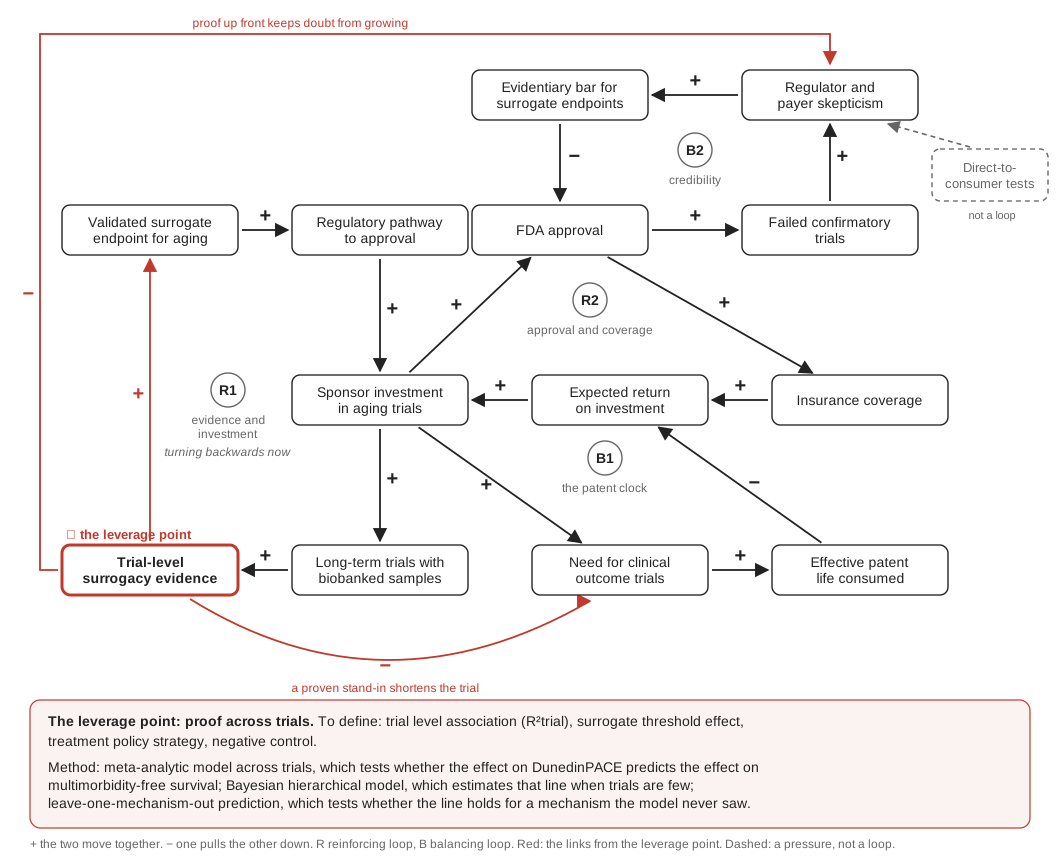
Figure 1. The map: four loops that keep drugs for aging from approval, and the arrow nobody has drawn. Each box is something that can rise or fall, and each arrow says what pushes it: a plus means the two move together, a minus means one pulls the other down. R1 and R2 feed themselves; B1 and B2 hold things back. The boxes carry the field’s terms; a validated surrogate endpoint is a proven stand-in. The red box, proof gathered across many trials, is the only box on three loops. The dashed note, tests sold direct to consumers by mail, is a pressure, not a loop. Drawn for this piece; the loop structure is this piece’s own reading of the sources named in the text.
Every loop on the map is stalled, and one box on it is empty. Why that box, and what would fill it?
You finished a month of a new routine last night: smaller dinners, a walk after work, a capsule swallowed with breakfast coffee. Your first card said 1.1. Your partner took the test too, at that kitchen table, and your doctor, shown both cards, had nothing to read them against. The order page for a second kit glows on your phone, $499 again. Two $499 readings can show the number fell, but can they show the fall bought a single healthy year? No trial yet says. Tap order, and $998 will have measured a month of dinners on a scale with no years printed on it.
A Map of What Pushes What
On July 6, 2023, the FDA fully approved the Alzheimer’s drug lecanemab. Medicare answered the same day. Its statement opened: “Broader Medicare coverage is now available.” The coverage came with a condition: a place for each patient in a registry that Medicare helps run. The head of the agency that runs Medicare, Chiquita Brooks-LaSure, put the trade in one line. The agency would “cover this medication broadly while continuing to gather data that will help us understand how the drug works.” Approval turned into coverage.
Coverage turns into sales, and sales pay for the maker’s next trial, which can bring the next approval. Those four steps close a circle, and each turn of it makes the next turn easier. On Figure 1, that circle is the loop marked R2. Donella Meadows, a scientist who studied how systems behave, defined loops like it in one line.
“A negative feedback loop is self-correcting; a positive feedback loop is self-reinforcing.”
Maps like Figure 1 call the first kind balancing, marked B, and the second reinforcing, marked R. A reinforcing loop “exhibits amplified or spiralling behaviour,” in the words of one guide for health researchers. The whole drawing is a causal loop diagram, a picture of “what actions or mechanisms drive behaviour in a system.”
R1, on the map’s left, is the loop drugs for aging need first, and today it turns backwards. Nothing is proven, so there is no route to approval. Without a route, little money goes in. Without money, no trial runs long enough to prove anything.
A map like this is drawn to find the box worth pushing. People who study systems, Meadows wrote, “have a great belief in ’leverage points.'”
“These are places within a complex system (a corporation, an economy, a living body, a city, an ecosystem) where a small shift in one thing can produce big changes in everything.”
On Figure 1, which box is that place?
Someone comparing two health plans’ lists of covered medicines at open enrollment is looking at the end of R2. Look for a medicine on one list and not the other, and the year it was approved. Coverage follows approval, so a medicine with no route to approval is on no list at all. Miss the difference, and a needed medicine stays uncovered for a whole plan year. This fall’s open-enrollment packet, thick in the mailbox, is the cue. For pills against aging, both reinforcing loops are stuck. What holds them still?
What Holds It Still
TAME, part two’s trial of the diabetes pill metformin, has waited years for money and is still raising it. Part of what holds TAME back is a clock. Money for a pill against aging means a trial long enough to count diseases and deaths. The longer the trial has to run, the more of the patent’s life it eats, and the less the pill is worth making.
Follow the link out of sponsor money the other way on Figure 1, and it runs into that clock. That path is B1, a balancing loop that works like a brake: the harder investment pushes, the harder the clock holds it back.
The second brake is memory. When a drug is approved on a stand-in and the stand-in later fails, regulators and insurers grow wary of the next one. Part one’s plaque, accepted although its own reviewer found no evidence that it stood in for patients, is that kind of case. Doubt raises the bar for any stand-in, and a higher bar means fewer approvals. That loop is B2, and it makes the obvious fix a trap. Approve on a weak stand-in to speed things up, and B2 tightens. Demand long outcome trials instead, and B1 holds the pill back.
Someone on a team whose last shortcut failed knows both brakes. Every proposal since has needed twice the proof, and the proof takes months. At the next planning meeting, coffee going cold on the table, the question is which brake holds the plan, the clock or the memory of last time. What evidence, gathered once, would loosen both brakes?
The Arrow
One red box on the map loosens both brakes, and it is the only box on three loops. It holds proof, gathered across many trials, that a drug’s effect on a marker, a number such as DunedinPACE, predicts its effect on years lived well. Drawn out, the box is an arrow from the marker to the years.
Fill it, and R1 starts turning forward: a proven stand-in opens a route, and money follows. B1 loosens, because a proven stand-in shortens the trial. B2 stays slack, because proof up front gives doubt nothing to feed on. The box is a leverage point of the kind Meadows ranked sixth on her list, “the structure of information flows.” “Missing feedback is one of the most common causes of system malfunction,” she wrote. “Adding or restoring information can be a powerful intervention, usually much easier and cheaper than rebuilding physical infrastructure.” The box holds evidence, not money or law. A statistician can draw it.
The usual first check on a marker is whether people with a slower pace of aging live longer, and DunedinPACE passes it. The statistician’s turn is to change what a dot is: put the trials on the axes, not the patients. In Figure 2, each dot is one randomized trial. Across is the trial’s effect on the marker. Up is that trial’s effect on the outcome. If the dots line up, a new trial’s marker effect predicts its outcome effect.
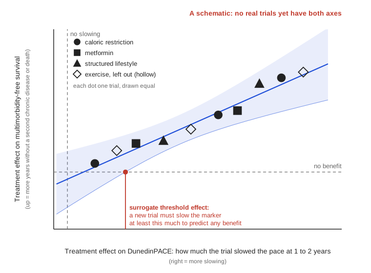
Figure 2. The arrow, drawn: one dot per trial. Across: how much each trial slowed DunedinPACE at 1 to 2 years. Up: its effect on years without a second chronic disease or death. The blue line is fitted to the dots, and the shaded band shows where a new trial’s dot is predicted to fall. The red mark is the smallest marker effect that predicts any benefit. Hollow dots are one mechanism, left out to test the line. A schematic drawn for this piece, with no data: no trial yet has both axes, and every dot is invented.
“When data are available from several trials, one can additionally assess the “trial level association” between the treatment effect on the surrogate and the treatment effect on the true endpoint.”
Its measure is R²trial, which says how tightly the dots hug the line: 1 means a trial’s marker effect predicts its outcome effect perfectly. A second measure asks a sharper question. How big a drop in the marker must a new trial show before it predicts any benefit at all?
“the minimum treatment effect on the surrogate necessary to predict a non-zero effect on the true endpoint”
On Figure 2, it is the red mark, where the band’s lower edge crosses no benefit. One more test asks whether the line works for any kind of treatment. Take away every trial of one mechanism, the hollow dots, and ask whether the line still predicts them. A marker that passes earns the label part two’s table gives blood pressure, mechanism agnostic: it works whatever way a drug acts.
For blood pressure, this arrow was drawn once across drug classes. The FDA’s 2011 guidance says so, in the sentence after the one part two quoted. “Numerous meta-analyses and a few large trials have found no consistent differences by class in effects on survival, myocardial infarction, or stroke,” it says. That held “for regimens achieving the same blood pressure goals, but some differences may exist.” A meta-analysis pools many trials into one analysis, and here each drug class is one mechanism’s group of dots. “No consistent differences by class” is the line still predicting a class when that class is set aside.
For aging, the dots are not there. Part two’s trial, CALERIE, slowed DunedinPACE 2 to 3 percent. Its authors wrote that this small effect “may be substantive” and cited another study. In their words, “in an independent study of older adults, 3% slower DunedinPACE is associated with a 15% lower risk of death.” That is an association among people, a dot on a chart of patients. It is not a dot on Figure 2. The 51 treatment studies in part two’s 2026 review give the horizontal axis only: aging tests, with no years lived well to put on the vertical one.
A parent reading the school district’s report card can treat each school as one dot. One school raised its test scores the most. The better question covers every school: did the schools that raised scores most also raise how many students finish? If they did, a jump in scores predicts a jump in finishing. This fall’s parent-teacher conference, before next year’s school choice, is the place to ask. For aging, which trials would make the dots, and which years would they count?
The Question
The 1.1 on the card from the mailbox is one woman’s number, not a trial’s. In my question, each trial gets a number like it, on Figure 2’s horizontal axis. My question: across randomized trials of treatments that work in different ways, does a trial’s effect on DunedinPACE predict its effect on what I would call multimorbidity-free survival?
That outcome counts the years before a second chronic disease, or death. Multimorbidity means two or more chronic conditions in the same person.
Why this question is mine comes down to one line. Proving that a surrogate works across multiple trials matters because a drug can successfully change the stand-in without actually saving or improving human lives. A question built on the arrow is built to catch a stand-in like that.
The trials are finished randomized trials of adults, with blood stored at the start and later, and long follow-up for disease and death. The interventions come from at least three mechanisms, such as caloric restriction, metformin, a structured lifestyle program and exercise. The marker is the change in DunedinPACE at 1 to 2 years. The outcome needs an estimand: a statement of what the trial sets out to estimate, with a rule for what happens after randomization. Events after randomization, such as quitting the routine, are what the guideline calls intercurrent events. For most of them, I would use this strategy.
“The occurrence of the intercurrent event is considered irrelevant in defining the treatment effect of interest: the value for the variable of interest is used regardless of whether or not the intercurrent event occurs.”
Put the woman with the card into such a trial. If she drops her routine in the second year, or her doctor starts her on a statin, she still counts in the group chance put her in. Death is different. The guideline says the treatment policy strategy “cannot be implemented for intercurrent events that are terminal events,” since nothing is measured after them. So death goes into the outcome itself, the way a composite outcome counts it: a second chronic disease or death, whichever comes first.
Someone reading a fitness program’s ad, which reports how much the members who finished lost, can ask the question that strategy asks. How did everyone who started do, including the ones who quit or got sick? If half the starters quit, the ad describes half the people who paid. The next sign-up offer in the inbox, its before-and-after photos side by side, is the cue. Where is the blood for such trials, and what would the analysis do with it?
The Plan, Item by Item
In a federal repository, freezers hold blood from a diabetes prevention trial. The agency that runs it wrote on its blog in 2017 that the repository “houses vetted data, genetic samples, and an array of biologic specimens” from many studies. One is the Diabetes Prevention Program (DPP) and its Outcomes Study (DPPOS), which tested a lifestyle program and metformin, two mechanisms the question needs. A literature search turned up no DunedinPACE analysis of those samples. They are a candidate for dots, not a result.
The plan for those dots is part one’s checklist, turned around: the steps that would draw the arrow. Part one ran these tests on the plaque after the fact. Here they are set before any data.
- Within each trial. Does a person’s change in DunedinPACE go with that person’s outcome? This is the patient-level test part one’s reviewer ran on the plaque, the Prentice criterion. It is needed, and not enough.
- Across trials. A meta-analytic model across trials fits the line on Figure 2, and reports R²trial and the surrogate threshold effect.
- Across mechanisms. The hollow-dot test from Figure 2 has a name, leave-one-mechanism-out prediction. It is a grouped form of leave-one-out cross-validation. In that method, one observation is held back, the model is fitted to the rest, and the held-back one is predicted. Here the held-back group is every trial of one mechanism. Part one’s reviewer split the drug’s effect by gene, carrier or not; here the split is by mechanism.
- A negative control. In part one, a drug cleared the plaque on the scan, and the patient did not do better. Epidemiologists build that case in on purpose and call it a negative control. Its purpose is “to reproduce a condition that cannot involve the hypothesized causal mechanism,” in the words of Lipsitch and colleagues. Yet it should be “very likely to involve the same sources of bias that may have been present in the original association.” Here it is a trial that moves DunedinPACE with no plausible route to health. If the line, fed that trial’s drop in DunedinPACE, predicts a benefit the trial never showed, the marker can move without the patient, as the plaque did.
- Rules set before the data. The plan is registered and locked before any DunedinPACE reading is linked to any outcome, as part one’s rules required. It names in advance the tipping-point analyses: how badly the people who left would have to fare before the answer flips.
The plan’s main risk is power, the chance of finding a link that is really there. A line fitted to a handful of trials has wide bands, so a real link can hide. A Bayesian hierarchical model is the plan’s answer. It treats each trial’s effect as drawn from one shared spread of effects, so a few small trials borrow strength from each other. Even a careful “not yet” from the hierarchical model would say how large the next trials must be.
Someone handed a consent form for a research blood sample, at a clinic visit or in a study invitation, holds part of one future dot on Figure 2. The step is to read it, and to ask whether the sample will be linked to health records for years. The question is worth forwarding to anyone who runs a study that keeps blood. Who links the blood to the years? That link is the arrow, and until someone draws it, each frozen tube is half a dot.
A Closing Invitation. The card stood for every number sold or approved before anyone showed that moving it moves the years. What aging lacks is one arrow of evidence, drawn across many trials, that makes a marker a stand-in for the years.
- Name the year. Now, if a health app is open on your phone, look at one number it tells you to change, such as steps or resting heart rate, and at what you give up each week to move it. Which year of your life is that number meant to stand for? Does anything on the glowing screen say?
- Ask how many trials. This month, about the last kit, supplement or plan you paid for to move a number, ask the seller or your doctor one question, and hear how long the pause is. In how many trials did changing this number change how people did? What did it cost you?
- Give a tube its years. The next time a consent form for research blood reaches you, at a clinic or by mail, ask whether the sample will be linked to your health records for years. A linked tube helps the next patient; one without costs a needle and answers nothing. What would your tube need to become a dot?
The plaque left the scan while the patient got worse. Until a linked tube becomes a dot, and enough dots draw the arrow, the card on the fridge cannot show that its 1.1 is not another plaque.
Where This Came From
I drew the map from the homework that made parts one and two: the review read section by section, then the table read column by column. The trial-level test I lean on grew up in cancer trials; Buyse and colleagues’ 2016 review works through its examples there.
Intellectual Honesty Note. Figure 1’s loops are this piece’s own reading of the sources it names: a causal loop diagram, not a model with estimated links. Figure 2’s dots, line and band are invented, and its vertical axis is simplified. A real analysis would plot each trial’s hazard ratio on a log scale; here the axis is glossed as the effect on years without a second chronic disease or death. Leaving out one mechanism at a time is this piece’s own reading; the surrogacy papers validate across trials, not across mechanisms by name.
Using a negative control on a trial-level model is this piece’s own reading; Lipsitch and colleagues write for observational studies. Multimorbidity-free survival is my own name. It is built from the WHO’s definition of multimorbidity and ICH’s composite strategy, and no source I searched defines it as a trial outcome. Reading the 2011 guidance’s class meta-analyses as the arrow drawn once, informally, is this piece’s own reading; the guidance does not call them a surrogacy analysis. The 15 percent is an association in another study, as CALERIE’s authors report it, not a trial result.
The seller’s page never says that 1 is the calendar rate, so the scale’s meaning is taken from the literature. The people in the scenes are invented: the woman and her household, the company and its reviewer, and the reader in each example.
References
Burzykowski, T., & Buyse, M. (2006). Surrogate threshold effect: An alternative measure for meta-analytic surrogate endpoint validation. Pharmaceutical Statistics, 5(3), 173-186.
Buyse, M., Molenberghs, G., Burzykowski, T., Renard, D., & Geys, H. (2000). The validation of surrogate endpoints in meta-analyses of randomized experiments. Biostatistics, 1(1), 49-67.
Buyse, M., Molenberghs, G., Paoletti, X., Oba, K., Alonso, A., Van der Elst, W., & Burzykowski, T. (2016). Statistical evaluation of surrogate endpoints with examples from cancer clinical trials. Biometrical Journal, 58(1), 104-132.
Cassidy, R., Borghi, J., Semwanga, A. R., Binyaruka, P., Singh, N. S., & Blanchet, K. (2022). How to do (or not to do)… using causal loop diagrams for health system research in low and middle-income settings. Health Policy and Planning, 37(10), 1328-1336. https://doi.org/10.1093/heapol/czac064
Centers for Medicare & Medicaid Services. (2023, July 6). Statement: Broader Medicare coverage of Leqembi available following FDA traditional approval. https://www.cms.gov/newsroom/press-releases/statement-broader-medicare-coverage-leqembi-available-following-fda-traditional-approval
Diabetes Prevention Program Research Group. (2002). Reduction in the incidence of type 2 diabetes with lifestyle intervention or metformin. New England Journal of Medicine, 346(6), 393-403. https://doi.org/10.1056/NEJMoa012512
Gelman, A., Carlin, J. B., Stern, H. S., Dunson, D. B., Vehtari, A., & Rubin, D. B. (2013). Bayesian data analysis (3rd ed.). CRC Press.
International Council for Harmonisation. (2019). E9(R1) addendum on estimands and sensitivity analysis in clinical trials. https://database.ich.org/sites/default/files/E9-R1_Step4_Guideline_2019_1203.pdf
James, G., Witten, D., Hastie, T., & Tibshirani, R. (2021). An introduction to statistical learning (2nd ed.). Springer.
Lipsitch, M., Tchetgen Tchetgen, E., & Cohen, T. (2010). Negative controls: A tool for detecting confounding and bias in observational studies. Epidemiology, 21(3), 383-388.
Meadows, D. (1999). Leverage points: Places to intervene in a system. The Sustainability Institute. (A shorter version appeared in Whole Earth, winter 1997.) https://donellameadows.org/archives/leverage-points-places-to-intervene-in-a-system/
National Institute of Diabetes and Digestive and Kidney Diseases. (2017). Dig data without dollars. Diabetes Discoveries & Practice [Blog].
Sehgal, R., et al. (2026). Responsiveness of epigenetic aging biomarkers to longevity interventions in humans. Nature Medicine, 32, 3477-3490. https://doi.org/10.1038/s41591-026-04562-9
TruDiagnostic. (n.d.). TruAge complete epigenetic collection. Retrieved October 9, 2026, from https://shop.trudiagnostic.com/products/truage-complete-epigenetic-collection
U.S. Food and Drug Administration. (2011, March). Hypertension indication: Drug labeling for cardiovascular outcome claims [Guidance for industry]. https://www.fda.gov/media/134777/download
Waziry, R., et al. (2023). Effect of long-term caloric restriction on DNA methylation measures of biological aging in healthy adults from the CALERIE trial. Nature Aging, 3, 248-257.
World Health Organization. (2016). Multimorbidity: Technical series on safer primary care.